Time Series and Development Tracking – Monitor the Impact of Actions Throughout the Season
A single satellite image shows status; a time series shows progress and impact. When you can compare images before and after fertilization, irrigation, or spraying, it becomes clear whether actions are working as expected. Agdir displays a time series for each field and links it to journal entries, so learning happens automatically and decisions improve each season.
Time Series in Agdir – History That Learns
Agdir collects satellite images throughout the season and displays development as a timeline for each field. Journal actions are marked directly on the timeline, making it easy to see whether fertilization increased biomass, irrigation stopped stress, or spraying improved uniformity.
How to Read Satellite Development Through the Season
Establishment (May–June)
· Normal curve: Steady increase in NDVI/biomass from sowing to full canopy
· Deviating curve: Slow start may indicate sowing issues or weather delays
· Action: Early fertilization or irrigation if establishment is lagging
Main Growth (July–August)
· Normal curve: High, stable NDVI with gradual rise toward peak
· Deviating curve: Drop in NDVI may indicate stress, disease, or nutrient deficiency
· Action: Corrective fertilization or irrigation at unexpected decline
Ripening (August–September)
· Normal curve: Controlled decline in NDVI as ripening begins
· Deviating curve: Too early or too late ripening compared to normal patterns
· Action: Adjust harvest timing or quality planning
Measuring the Impact of Actions – Before and After
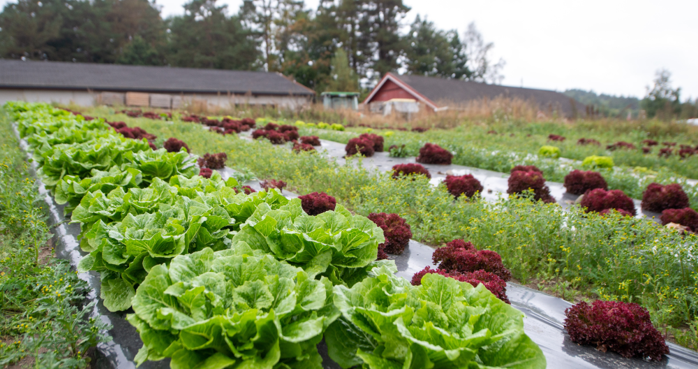
Fertilization
Compare NDVI 1–2 weeks before and 2–3 weeks after fertilization. An increase indicates a positive response.
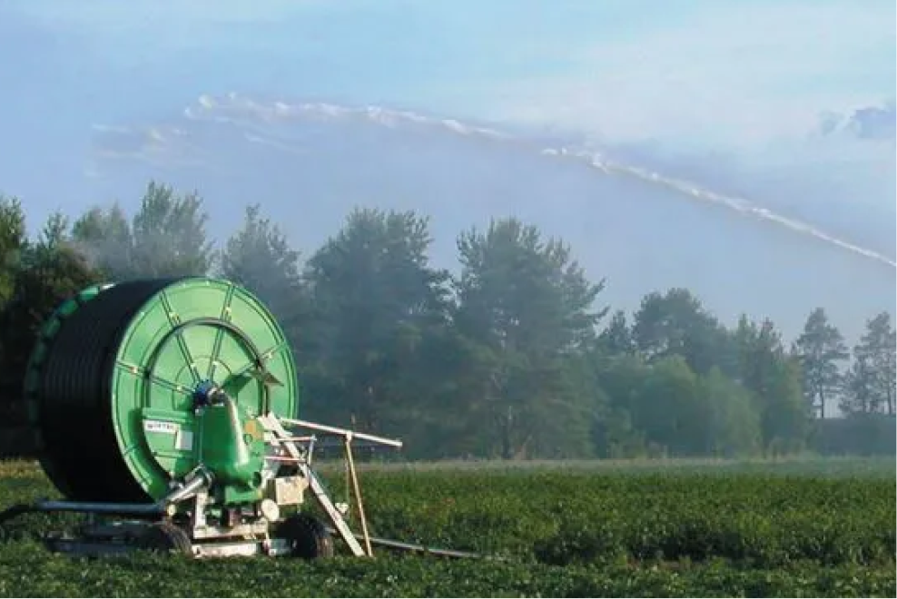
Irrigation
Track NDVI trends during irrigation. A plateau or recovery in the curve indicates effective irrigation.
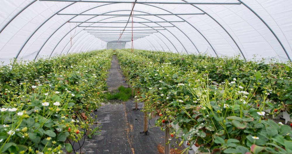
Spraying (Fungicides)
More even NDVI distribution after spraying may signal controlled disease pressure.
Practical Examples of Time Series Interpretation
Example 1: Fertilization That Worked
NDVI rose from 0.45 to 0.65 within three weeks after fertilization. Weather conditions were favorable. Same dosage recommended next year.
Example 2: Irrigation That Saved the Season
NDVI dropped from 0.70 to 0.50 during drought. Irrigation began, and the curve stabilized. Stress was stopped in time.
Example 3: Spraying with Mixed Results
NDVI uniformity improved, but overall levels declined slightly—possibly due to heat stress or phytotoxic effects from the fungicide.
Comparison Between Fields and Years
· Field vs. field: Which field responds best to the same treatment?
· Year vs. year: How does seasonal weather affect development curves?
· Crops: Differences in response time and maximum NDVI across crop types
Interpreting in Context with Weather Data
Weather development influences satellite interpretation:
· Rain after fertilization: Expect faster response
· Drought: NDVI decline is normal; irrigation can reverse it
· Cold periods: Slower response to all treatments
Building Seasonal Profiles for Crops
Over time, Agdir builds “normal” development curves for each crop and region. Deviations from these profiles trigger recommendations for intervention or further analysis.
Summary
A time series gives satellite data real meaning and value. When you can track progress over time and connect it to your actions, decisions become more precise and less based on guesswork.
Start by following one field through the season—observe how your actions influence its development curve, and use that insight to plan better next year.