Satellite Analysis in Agdir: See Variations, Prioritize Smarter, Track Progress
Satellite images can seem complicated, but in Agdir they becomepractical tools. You can see where a field has the greatest potential, wherestress appears first, and where interventions have the most impact. Combinedwith weather, sensors, and journals, satellites become part of dailyplanning—not just reports to review afterward. For family farms, this meansfewer wasted trips, more targeted effort, and higher yield per invested krone.
Satellite in Agdir – From Image to Action per Field
Agdir translates satellite images into actionable recommendations.Red zones show where fertilization or irrigation has the greatest effect; greenzones can often wait until the next treatment. Time series show whetherinterventions work as expected. This makes satellites part of thedecision-making process, not just documentation.
What Satellite Analysis Shows – and Why It’s Useful
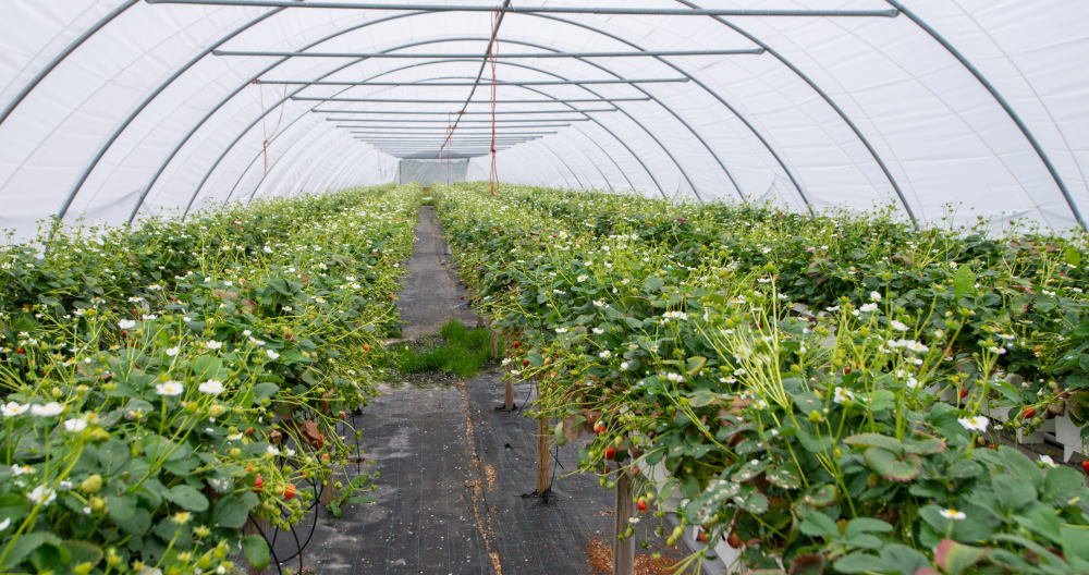
Biomass Variation
Green areas indicate good growth; yellow/red areas are struggling.Prioritize actions where the satellite shows potential for improvement.
Stress Detection
Satellites detect stress before it’s visible to the eye, givingearly warnings and opportunities for corrective action.
Development Tracking
Compare images before and after treatments. See if fertilization,irrigation, or spraying delivered the expected response.
Seasonal Trend
Track crop development throughout the growing season. Identifyfields performing above—or below—expectations.
Practical Use of Satellite Data – Five Typical Scenarios
Fertilization Priority Under Time Pressure
When the weather window is short and you can’t fertilize allfields, satellites show which will respond best to extra nutrients now.
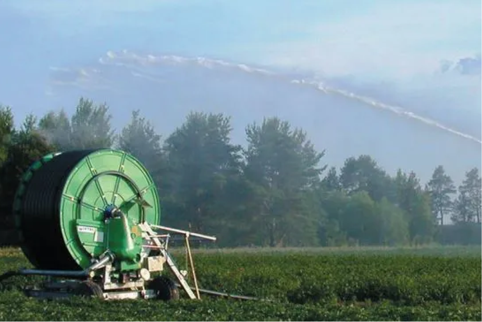
Irrigation Prioritization During Drought
When pump capacity is limited, red/yellow zones take priority;green zones can wait.
Treatment Evaluation
Two weeks after fertilization—did the field respond as expected?Adjust rate and timing for next round.
Early Disease Detection
Uneven biomass can indicate disease or pests. Satellite datacombined with weather information gives early warnings.
Planning Next Season
Which fields performed best? Which showed the most variation? Usethe data to improve next year’s planning.
How to Read Satellite Images in Practice
Color Scale and Interpretation
· Green: Strong growth, high biomass
· Yellow: Moderate growth, may respond to treatment
· Red: Weak growth, stress, or deficiency
Patterns That Matter
· Ridges vs. low spots: Dry ridges often appear yellow/red; wetdepressions green
· Edge effects: Zones near water often appear greener than thefield center
· Geometric patterns: Can indicate machine or application errors
Timing and Seasonal Variation
The same color can mean different things depending on crop type andseason. Agdir adjusts interpretation based on crop and timing.
Satellite Combined with Other Data – Where the Value Emerges
Satellite + Weather = Timing
Satellite shows where; weather shows when. Prioritizered zones in safe weather windows.
Satellite + Sensors = Precision
Soil moisture sensors confirm whether red zones are caused bydrought or other issues.
Satellite + Journal = Learning
Compare satellite responses with past treatments. Build knowledgeof what works where.
Satellite + Economy = Profitability
Focus expensive fertilizers and pesticides where satellites showthe greatest potential for improvement.
Getting Started with Satellite Analysis – Gradual and Practical
Step 1: Activate Satellite Layer
Turn on satellite view per field in Agdir to get an initialimpression of variations.
Step 2: Identify Patterns
Mark areas with consistent differences (always green, always red).Note links to topography or soil type.
Step 3: Test Prioritization
For the next intervention, prioritize yellow/red zones first.Document results in the journal.
Step 4: Evaluate Effect
Compare satellite images before and after treatment. Adjustapproach based on response.
Step 5: Build Routines
Use satellite data in weekly planning. Let variations influencetask order and dosage.
Typical Satellite Patterns and Their Meaning
Dry Ridges, Wet Depressions
Irrigation needs vary within the field. Prioritize short intervalson ridges.
Edge Effects Along Drainage Ditches
Better growth along ditches indicates good drainage. Considerexpanding the drainage system.
Geometric Irregularities
Striped patterns may indicate spreader or sprayer issues. Checkequipment and calibration.
Seasonal Development
Compare early and late season. Fields that start slow may have morepotential for additional interventions.
Limitations and Realistic Expectations
Satellites show symptoms, not always causes. Redzones may result from drought, nutrient deficiency, disease, or soil problems.Combine satellite data with local knowledge and other sources for accuratediagnosis.
Frequently Asked Questions
How often are new images available?
Depends on weather and satellite coverage—typically every 3–7 daysduring the growing season.
Can cloud cover ruin the images?
Yes, but Agdir uses multiple satellite sources to reduce thisissue.
Does satellite data cost extra?
No, basic satellite analysis is included in Agdir.
How accurate are the analyses?
Satellites are excellent for prioritization and trend analysis butnot a replacement for field observation.
Summary
Satellite analysis makes it easier to see the big picture. Whenvariations become visible and priorities clear, efforts can focus where theeffect is greatest. Combined with weather, sensors, and journals in Agdir,satellites become a practical part of daily planning—not just reports toadmire.
Activate the satellite layer in Agdir today, identify variations inyour fields, and test prioritization based on biomass maps to experience how satellite insights lead to better decisions.