Biomass Maps and NDVI – Practical Interpretation for Norwegian Conditions
NDVI and biomass maps may sound technical, but they’re really just about seeing where your plants are thriving (green) and where they’re struggling (yellow/red). Under Norwegian conditions—with variable weather and shorter growing seasons—interpretation must be adapted to local crops and climate. Agdir does this automatically, showing both what the images mean and how to act on them.
NDVI Explained Simply – Plant “Health” Seen from Space
NDVI—Normalized Difference Vegetation Index—is a satellite-based measure that quantifies vegetation health and density by analyzing how plants reflect light. Higher NDVI values indicate healthier, denser vegetation, while low or negative values may reflect poor soil, snow, water, or plant disease.
In Agdir, this is visualized as color maps: green = good, yellow = moderate, red = poor/stressed.
Interpretation Adapted to Norwegian Crops
Grain and Grass
· Green (high NDVI): Dense crop stand, good water and nutrient availability
· Yellow (moderate NDVI): Thinner crop stand or early stress
· Red (low NDVI): Poor establishment, drought, or nutrient stress
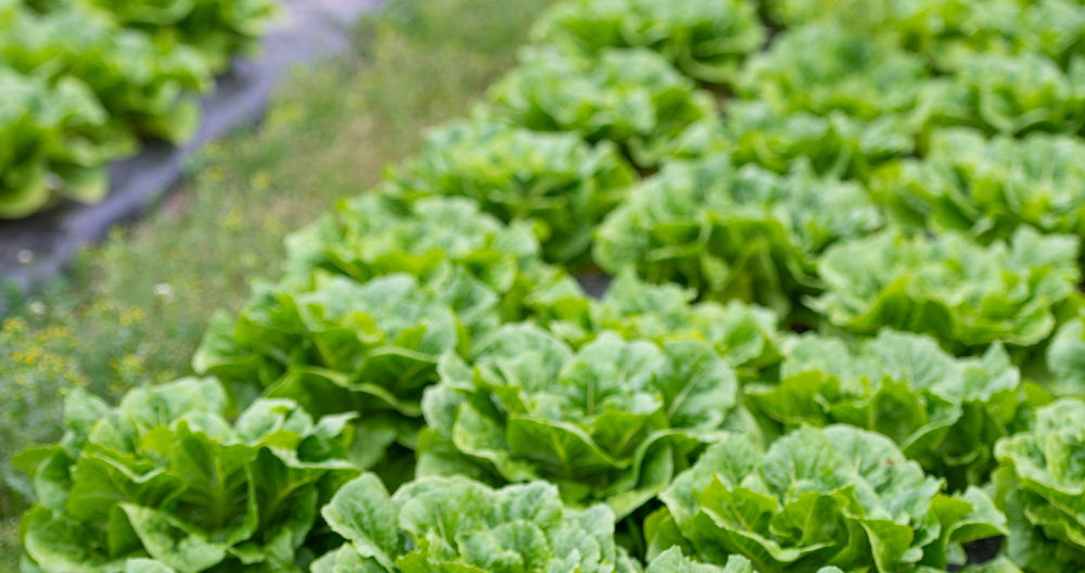
Vegetables and Root Crops
· Green: Rapid growth and good leaf development
· Yellow: Slower growth, possible low nutrients or water stress
· Red: Clear stress, urgent need for intervention
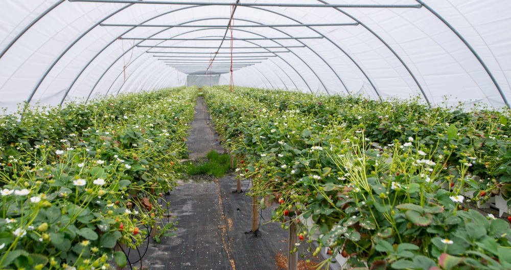
Berries and Fruit
· Green: Healthy leaf growth and fruit development
· Yellow: Moderate growth, possible seasonal variation
· Red: Stress that can affect quality and storability
Seasonal Variation – Same Color, Different Meaning
Early Season (May–June)
Low NDVI values can be natural due to late establishment. Focus on extreme deviations.
Mid-Season (July–August)
NDVI differences are most significant. Green/red contrast clearly shows where action is needed.
Late Season (September)
Falling NDVI can indicate normal ripening. Compare with expected crop patterns.
Practical Use of Biomass Maps
Fertilization Priority
Yellow zones often respond well to supplemental fertilization. Red zones should be diagnosed first (drought vs. nutrient issue).
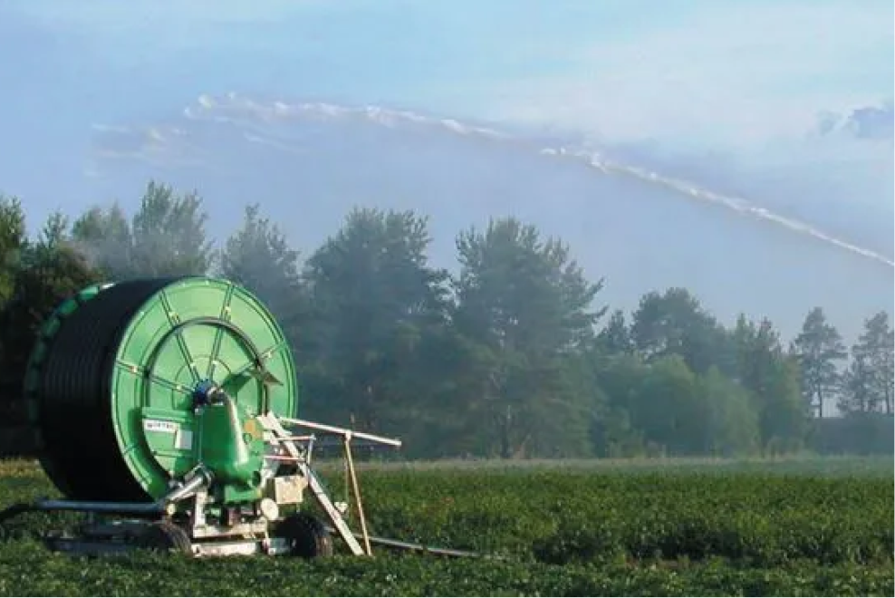
Irrigation Planning
Red zones take priority during drought. Green zones can often wait for rainfall.
Quality Assessment
Even green color indicates uniform quality. Large variations can affect sorting and pricing.
Interpreting in Context with Weather Data
· Dry periods: Red zones likely need water
· Wet periods: Red zones may have other causes (disease, soil compaction)
· Heat peaks: Yellow zones can quickly become red without intervention
Common Sources of Error – and How to Avoid Them
· Cloud shadows: Can create false red zones. Compare with earlier images.
· Wet soil: Reflects differently than dry soil. Review rainfall history.
· Uneven ripening: Natural in late season, not always a sign of problems.
Summary
NDVI and biomass maps aren’t difficult once you understand basic interpretation adapted to Norwegian conditions and crops. Green = good, yellow = moderate, red = needs attention—but always in the context of season, weather, and crop type.
Start by identifying clear green/red contrasts in your fields, test prioritization based on the color codes, and build your own experience with interpretation season by season.